In my illustrator course I designed app screens, an iconset and a logo. I decided to create an app for Acro Yoga. The main idea: People who practice acro yoga have the possibility to connect, practice together, learn from each other and perhaps earn some money.
Styleguide
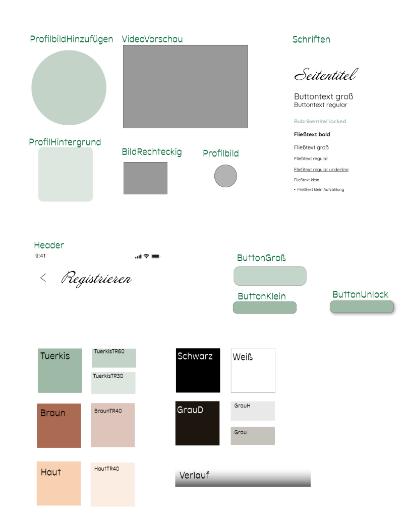
The styleguide shows the containers and colours used in my design. If the app should be programmed later, the CSS properties are necessary. The style guide makes it possible to export these properties.
In the app workshops with videos and descriptions to learn flows would be available. Some of them would have to be unlocked for a small amount of money. This would give passionate acro yogi couples the possibility to earn some money with the workshops they prepare and share in the app.
Logo Design
My goal was to put emphasis on humanity throughout the design, because that’s an important part of acro yoga. It brings people together and makes it necessary to have a good communication, respect each others boundaries. Usually people meet in the park, teach each other and socialise.
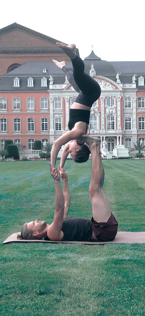
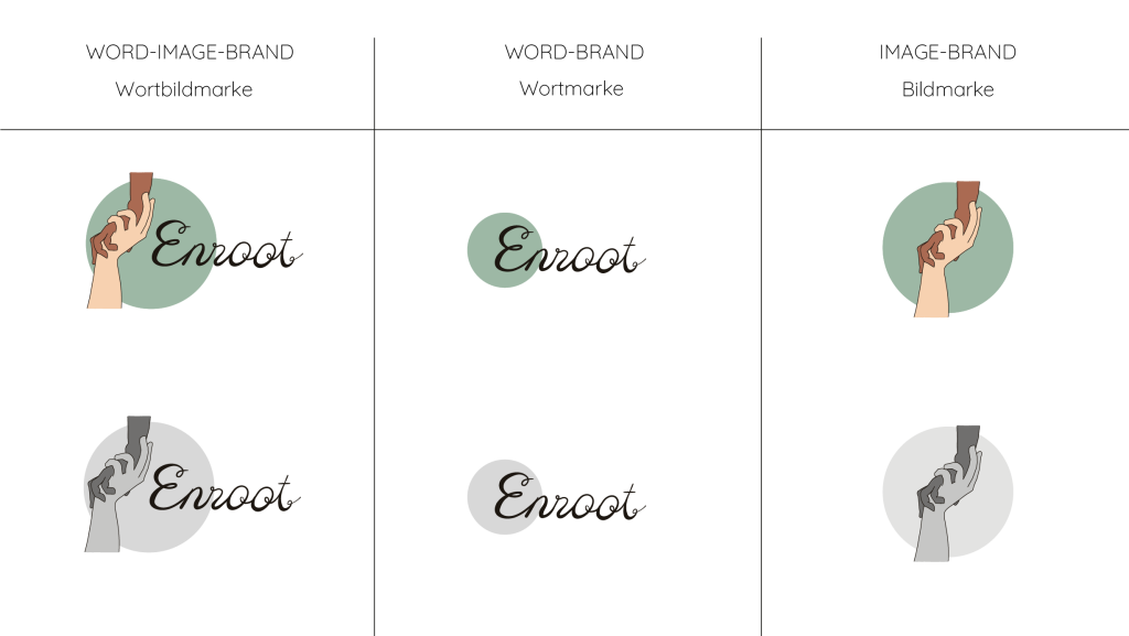
The two hands in this position are very typical for acro yoga. Everyone who has practiced it once, knows this position. It also symbolises trust and connection. That’s why I chose to illustrate it for my logo.

The lettering should fit the human centred design. Therefore I created a hand-drawn lettering, that has the look of ink and pen on a piece of paper.
“Enroot” in German is “verwurzelt”. It means to establish something, for example plants, by fixing their roots in the earth. What does that have do to with acro yoga?
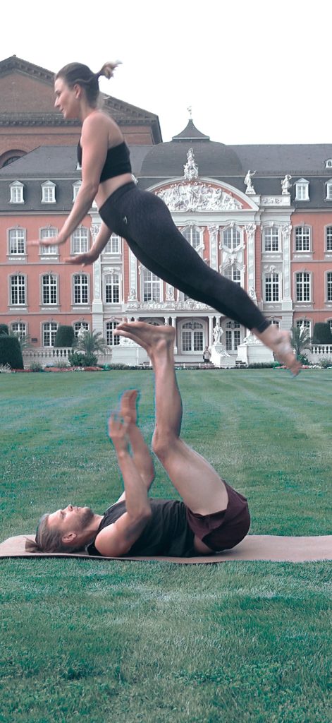
Actually a lot. The base (person on the bottom) needs to have a good connection to the ground beneath. The weight of the flyer (person on the top) goes into the ground. That way the base doesn’t have to do everything out of strength. With a good technique and the deep rootedness even a smaller base can manage to fly someone much taller!
Iconset
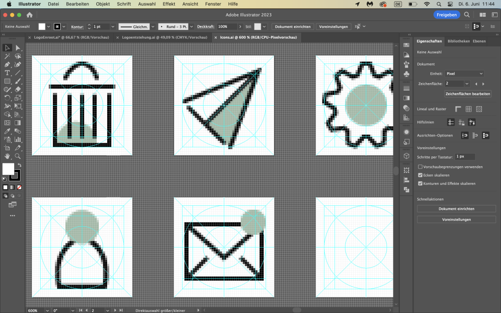
The turquoise circle from the logo is repeated in the icons, that I created for the application. To meet the requirements for icons, I used the minimum outline-width of 2 px and built them in the pixel-preview in Illustrator.

Graphics
The illustrated graphic should support the human focus of the topic. If the app would be programmed, I would draw the two acro partners in other flows and positions. They would function as mascots and create a high recognition value of the app.
Screendesigns
Screen 1: Shows the “splash” screen. That’s usually the first thing users see when they open the app.
Screen 2: Register or sign in.
Screen 3: Registration for new users.
Screen 4: In the category “flows” users can choose their level.
Screen 5: After choosing the level, the user gets forwarded to related flows. Two of every category are for free. Further flows are listed. By scrolling down the user would see small previews of them.
Screen 6: If the user is interested in one of the flows, he/she can click on it and get more information. On that screen the flow can be unlocked for a certain amount of money.
Screen 7: Shows the category “acro friends”, where the user can see with whom he/she is already connected. From here the user can get forwarded to the message function or click on the profile of an “acro friend”.
Level structure
In the course we learnt that not just the result is relevant, but also the way of structuring the project. For example if we work together with different people, all of the group members need to have a good overview and be able to work with our files.
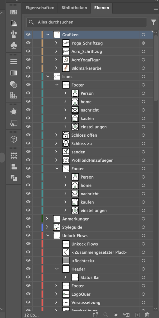
For that, we learnt, it’s mandatory to have a clean, ordered layer structure. That happens through naming all the layers, creating clusters for better clarity and exporting the files in the right way.
